Prefabrykacja
Prefabrication - UX/UI design of a B2B platform
My role
Brand/UI/UX
About the project
Portal about wooden, steel and concrete prefabrication
Challenge
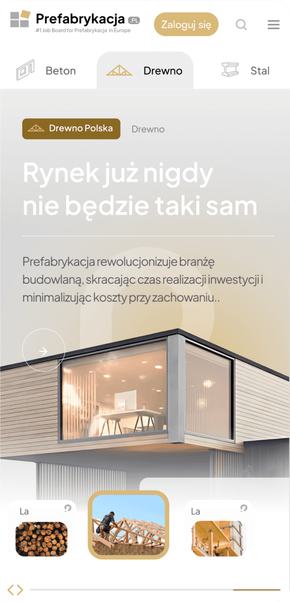
One of the challenges was to divide the portal into 3 categories and 2 target groups.


Modal
Modal – Target Group Selection

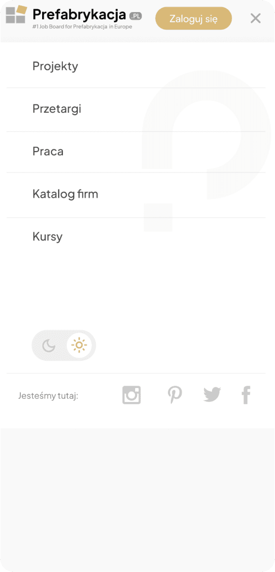
Expandable navigation
Left-side slide-out navigation Navigation – Menu Categories


Step 1
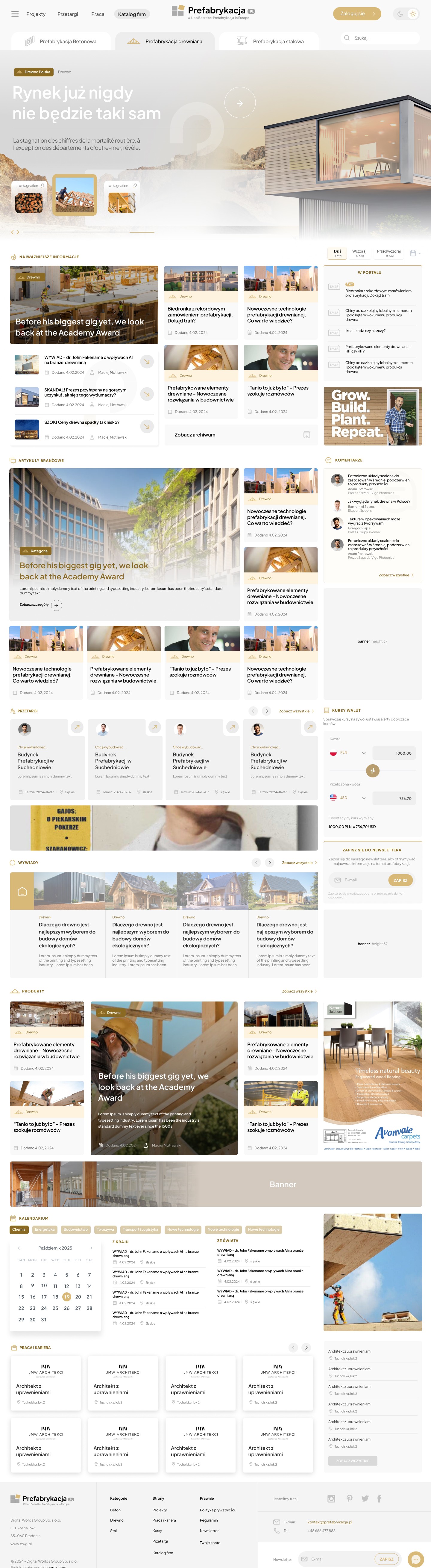
Using different colors to distinguish prefabrication categories
To highlight the differences between the three main prefabrication categories – wood, concrete, and steel – I decided to design three color versions of the portal, each dedicated to one of these categories. The key goal was to create a visual distinction that would allow users to intuitively navigate the portal and quickly find the relevant sections without having to consider the classifications.
While the layout of the projects remained consistent, the color differences for each prefabrication category allowed users to immediately understand which area they were in. This visual change was intended to facilitate easier navigation while maintaining aesthetics and design consistency.
Furthermore, to streamline the orientation process and enhance user comfort, tabs were introduced that allow for quick access to individual prefabrication categories. These tabs were designed in a minimalist manner to avoid disrupting the overall harmony of the interface while also clearly highlighting the differences between categories, significantly improving the user experience.


Step 2
The Job Board project as a central recruitment point
The Job Board is a key element of the portal, not only allowing for quick access to job offers in the prefabrication industry but also providing users with a user-friendly and effective tool for applying for positions they are interested in. Thanks to its well-designed structure and convenient filter system, a sticky map, and category selection, users can easily find offers that match their skills and professional needs, resulting in a more efficient recruitment process. Direct application for a position is also possible. Tabs on the portal allow users to filter out offers that do not interest the user.


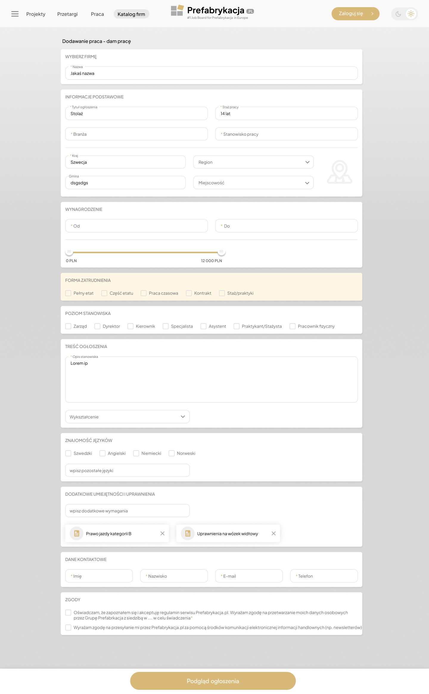
Step 3
Improved application process – Sticky navigation bar + intuitive filter system
One of the key elements that improved the UX of the job application process was the implementation of a sticky navigation bar in the application form. The goal of this solution was to provide users with convenient access to the "Apply" and "Preview Application" options, regardless of their current stage in the application process.


Step 4
Prefabricated House Designs


Step 5
Online Course Mockups – Platform based on BuddyBoss

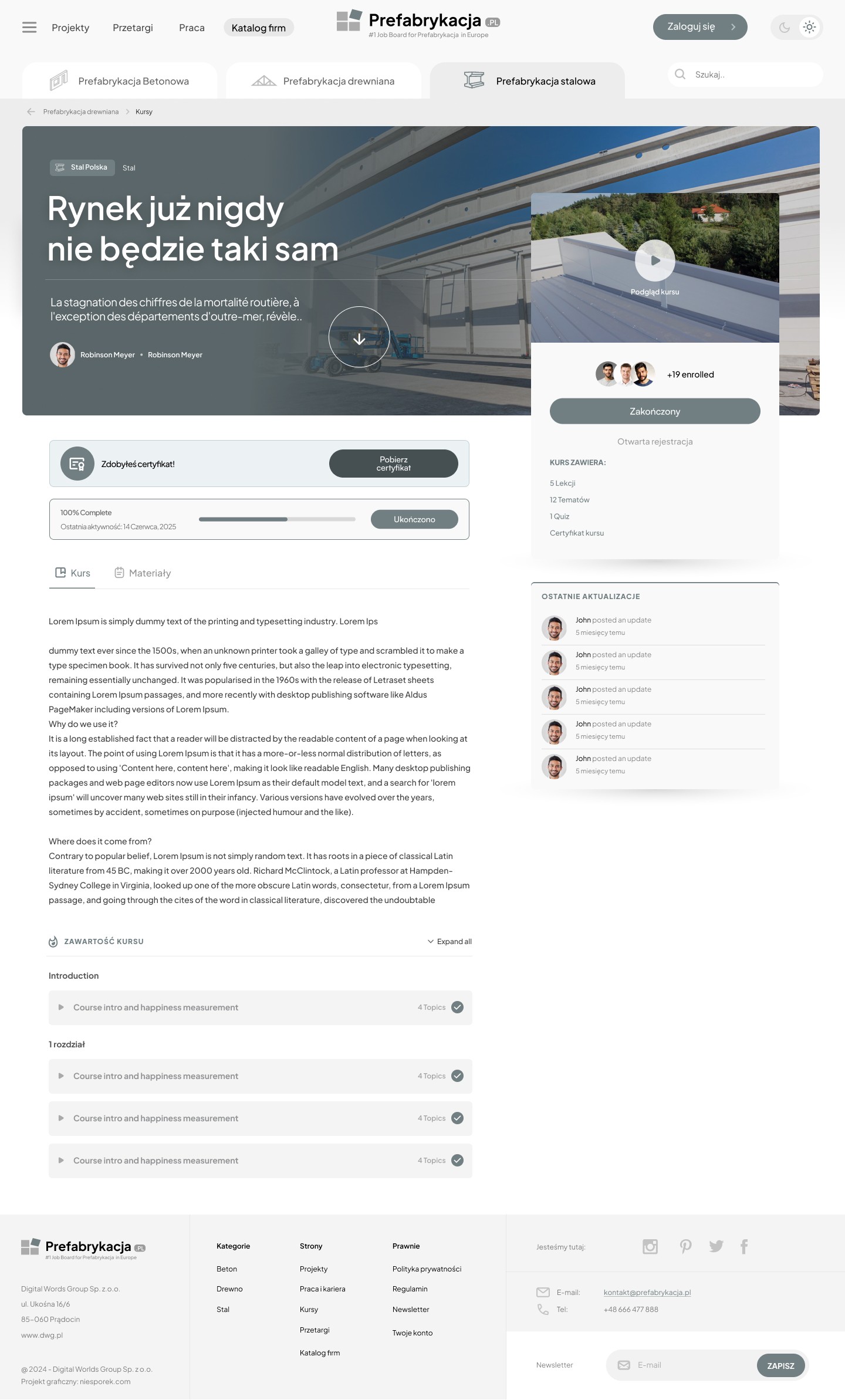
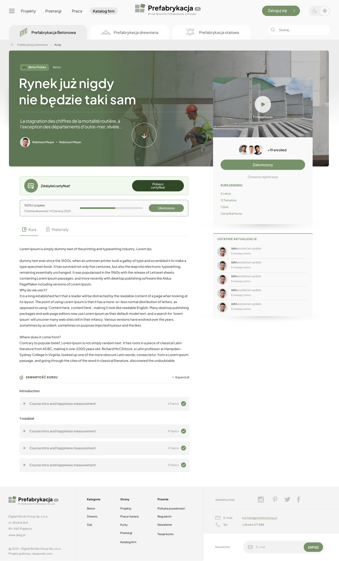


Step 6
BuddyBoss – Portal profile
In our project, the BuddyBoss platform was used as a framework for creating an educational and social space in the prefabrication area. Thanks to ready-made solutions and a flexible interface, we were able to focus on the user experience (UX), designing:
a clear course structure,
engaging user profiles,
a knowledge zone with comments and ratings,
a forum for specialists and investors,
a notification and learning progress system.
Result: BuddyBoss significantly shortened the MVP implementation time while providing a solid technological foundation for further customization and development of the platform.

Step 7
View expert advice

Step 8
Single Product Page

Step 9
Single Service Page

Step 10
Article View with Comments
Designing an intuitive and engaging single-article view that not only presents content in an attractive format but also supports long-term user engagement, including through comments, newsletter subscriptions, and multimedia elements. I also designed additional proposals with magazine-style components.


Step 11
Article listing
Creating a structured, attractive, and easy-to-explore subpage with articles, tips, news, and inspiration. The key goal was to increase time spent on the site and facilitate access to expert knowledge.

Step 12
Find an idea for your next project
Designing an intuitive and engaging single-article view that not only presents the content in an attractive format but also supports long-term user engagement – including through comments, newsletter subscriptions, and multimedia elements. I also designed additional proposals with magazine-style components.
The result? The mockup allows the user to immerse themselves in the world of prefabrication through the lens of aesthetics and functionality, rather than technology alone. Thanks to this solution, the inspiration page not only builds engagement but also directs users to specific products and services – supporting lead generation.

Step 13
Management panel with UI KIT elements package
Creating a structured, attractive, and easy-to-explore subpage with articles, tips, news, and inspiration. The key goal was to increase time spent on the site and facilitate access to expert knowledge.


Step 14
Landing Page with Benefits Package
Designing a landing page to support a marketing campaign aimed at new users (individual/business/industry-specific), with a focus on presenting the value of the prefabrication portal in a simple, persuasive way and encouraging registration or contact.
